
Dental clinic · 2026
A dental clinic patients can find, read and book in one tap
Eleven treatments, each with its own page, in English and Gujarati. Built to open in about a second on a mid-range Android over 4G, and to put a call or a WhatsApp message one tap from every line of it.
Pramukh Multispeciality Dental Clinic · Radhanpur Circle, Mehsana, Gujarat
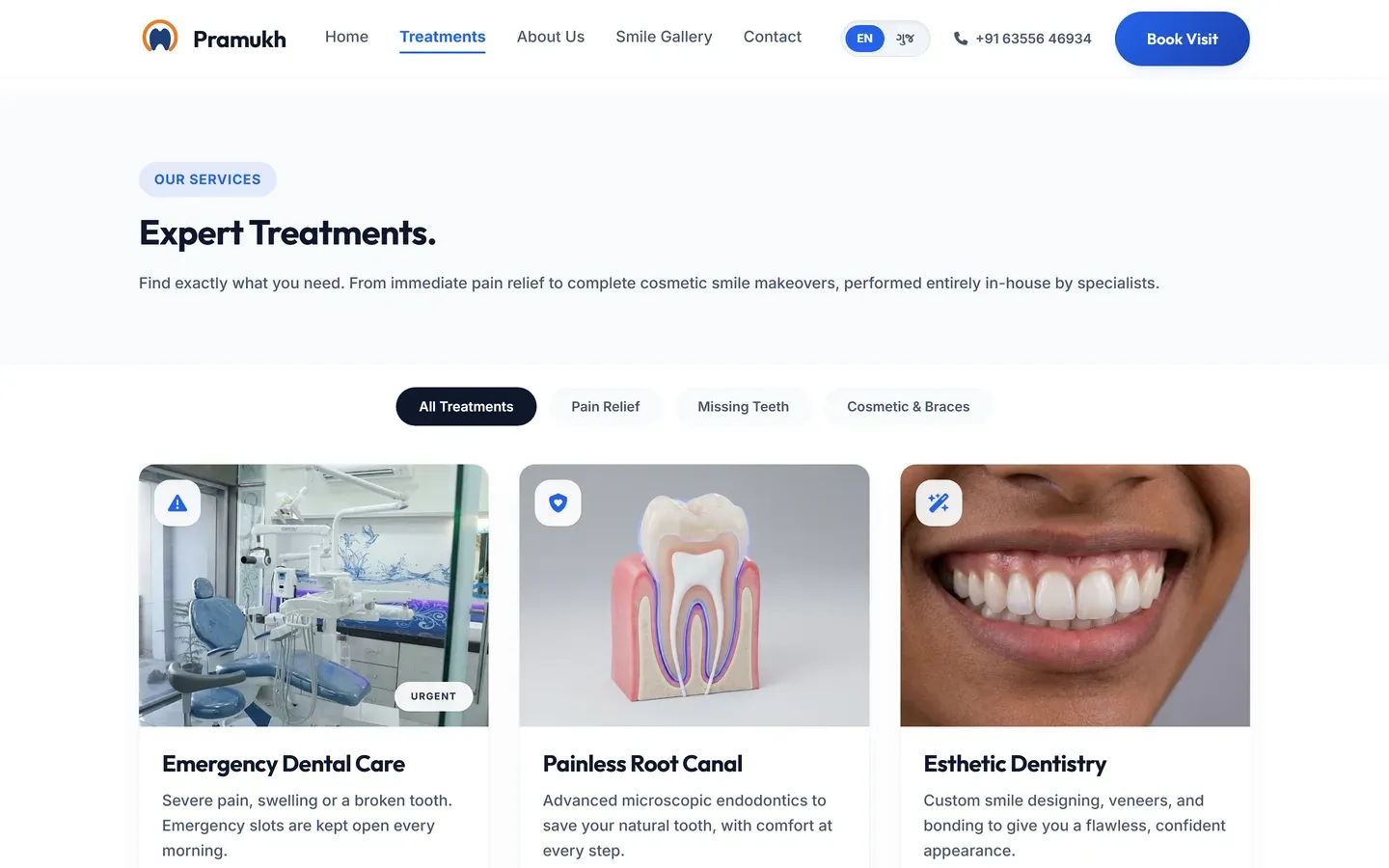
- Treatment pages, one for every treatment offered
- 11
- Treatment pages, one for every treatment offered
- Languages, the whole site, not just the menu
- EN + GU
- Languages, the whole site, not just the menu
- Opens in, on 4G, measured
- about a second
- Opens in, on 4G, measured
- Enquiry, call or WhatsApp, from any page
- Two taps
- Enquiry, call or WhatsApp, from any page
Before the build
Building for the patient who has not chosen yet
The brief was a website for a practice whose reputation was real and entirely offline. Everything a patient understood within a minute of walking in, they had no way of learning at eleven at night while searching "root canal cost in Mehsana" on a phone. So the site had to do the introducing: answer the search in the words it was typed, explain the treatment before naming it, and make the enquiry reachable from any line of any page. That decision set the structure of all eleven treatment pages.
What were we asked to build?
A website that could carry a first impression the practice had never had to make in writing before.
The framing we settled on decided everything after it: this is not a brochure for people who already chose the clinic, it is built for the patient who has not, who is deciding between three options on a phone and knows none of them. Every structural choice below follows from that one sentence.
It also set what we did not build. No welcome message, no mission statement, no photograph of the building on the homepage, because none of those answer the question the visitor arrived with. Dr. Chinmay Patel’s credentials, an MDS root canal specialist with more than ten years and some five thousand procedures behind him, are on the site where a patient weighing competence will look for them, rather than at the top of a page somebody is reading in pain.
Which four decisions shaped the build?
01
A page for every treatment, not a services list
All eleven treatments the clinic offers have their own page: root canal, re-root canal, emergency care, esthetic dentistry, post and core, surgical endodontics and the rest. One combined "Services" page cannot rank for eleven different searches and cannot answer eleven different worries. Splitting them is most of why the site gets found at all.
02
Bilingual, all the way down
Many of the clinic’s patients are more comfortable reading Gujarati. Every heading and every treatment explanation works in both languages behind a single toggle, driven by one translation dictionary so the two versions cannot drift apart as pages are added. A language switch that only translates the menu is worse than none, because it promises something it does not deliver.
03
Fully static
The site ships plain HTML and CSS with no framework JavaScript. There is nothing to slow it down on an inexpensive phone and nothing to break at two in the morning. Images are WebP, capped at 1600px. This is also the cheapest possible thing to host, which matters over years.
04
Symptom language, everywhere
Clinical accuracy in the content, patient vocabulary in the headings. The page is titled "Painless Root Canals" and the first line says it takes forty-five minutes. The word "endodontic" appears where it belongs, further down, once the reader already knows they are in the right place.
Which details actually mattered?
- Scroll animations respect
prefers-reduced-motion, so patients who turn animations off get an instant, still page. - The smile gallery handles before and after photographs properly, at full size, without a third-party lightbox script.
- A sitemap, a robots file and per-page metadata were part of launch rather than something added afterwards.
- Three articles answer the questions that come up before booking: the signs you need a root canal, root canal against extraction, and what it costs.
What was in scope, and what was not?
This project covers the website. It does not include the Google Business Profile, ongoing SEO or monthly care, and we are not going to claim credit for patient numbers we cannot measure from here.
What you can check yourself: it is live at pramukhdentalclinic.com. Open it on your own phone, on mobile data rather than wifi, and time how long it takes before you can read something.
Inside the build
Four decisions, and what they look like
Every screenshot below is the live site. The note beside each one is why it was built that way rather than the obvious way.
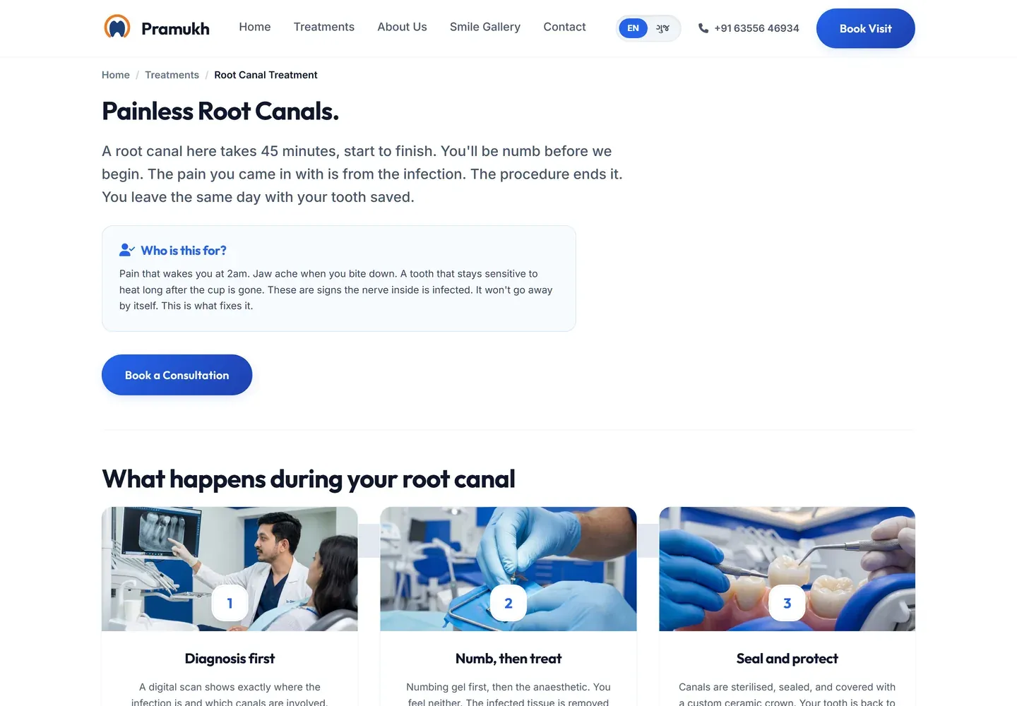
A page for the search, not for the brochure
Patients do not search "endodontics". They search the thing that hurts. Every treatment page opens with the symptom in the patient's own words, answers how long it takes and what it costs, and only then names the procedure. The "Who is this for" box is written from what people actually say at reception: pain that wakes you at 2am, jaw ache when you bite down.
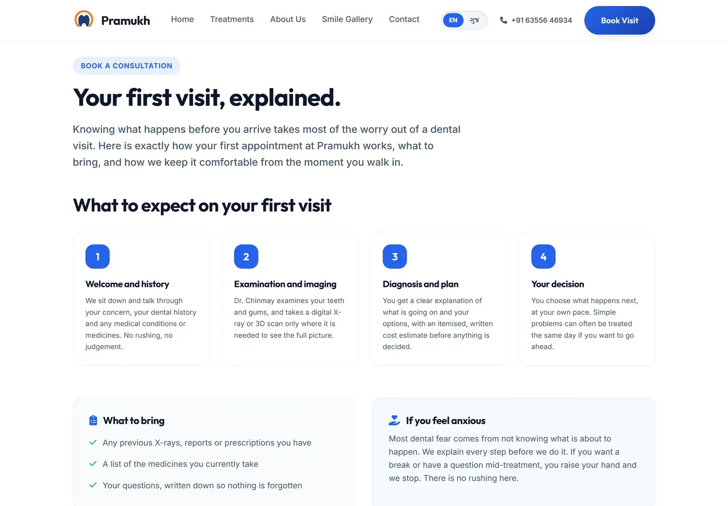
The page that answers the fear
Most dental hesitation is not about price, it is about not knowing what is going to happen. So the first-visit page walks through all four steps, says what to bring, and addresses anxiety directly rather than pretending it does not exist. This page exists because the clinic told us what patients ask in the chair, and we wrote it down.
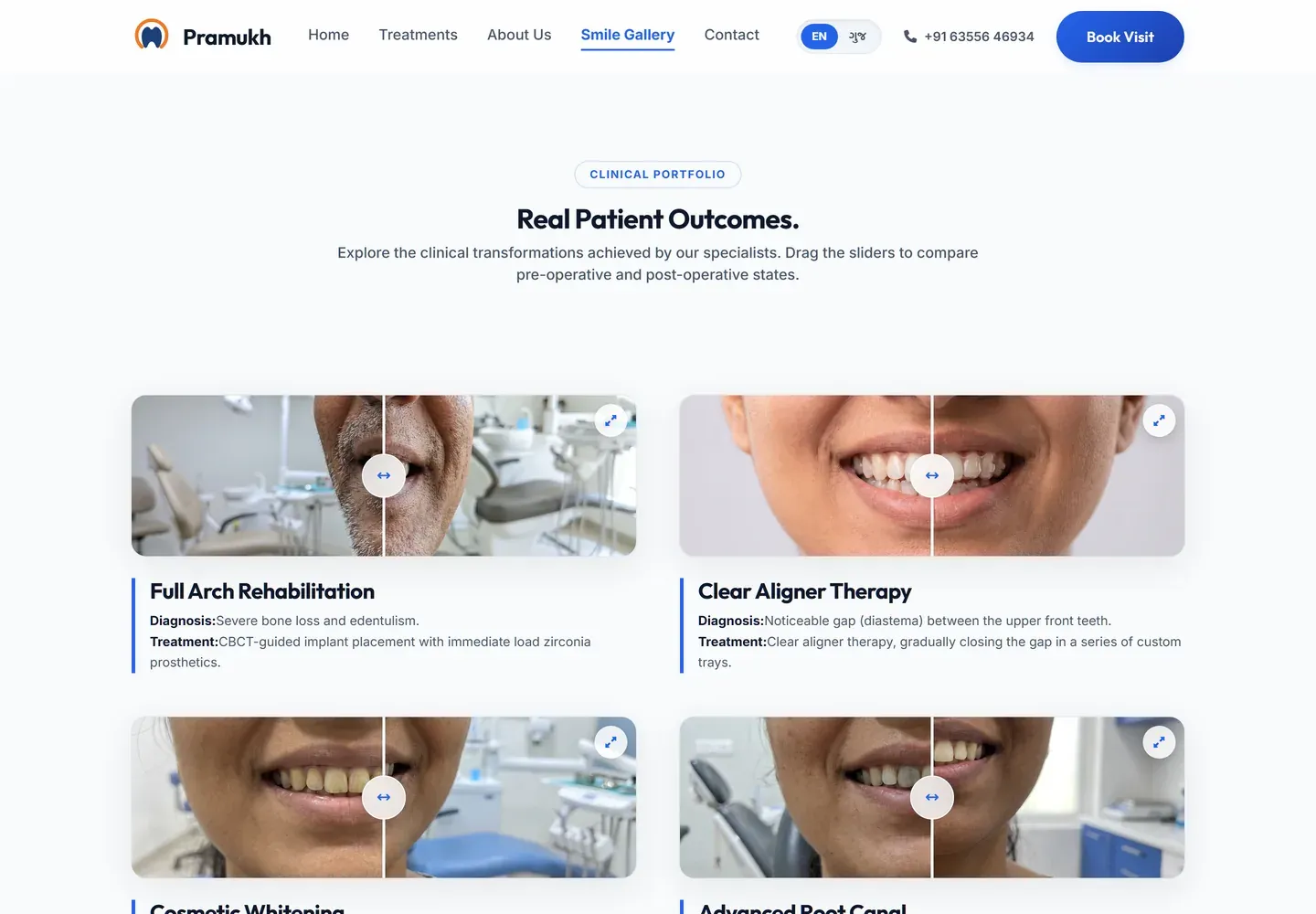
Before and after, with the diagnosis attached
A dental practice lives on results a patient can see, so the gallery is a page in its own right rather than a strip on the homepage. Each case carries the diagnosis and the treatment in plain words, which turns a photograph into an explanation. The drag handle then lets a patient compare the two states themselves instead of being shown a chosen crop.
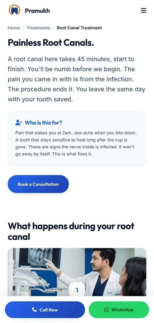
Built for the phone it will be read on
Almost every visitor arrives on a mid-range Android over mobile data, often at an odd hour. The call and WhatsApp bar stays fixed at the bottom of every page, so an enquiry is never more than one tap away no matter how far down someone has read.