
Guide for clinic owners
What a clinic website actually needs
The pages a clinic website genuinely needs, the ones it does not, and why a page per treatment matters more than anything else on the list.
18 July 2026 · 6 min read · CareInflow
Most clinic websites are built from the clinic’s point of view: a welcome message, a mission statement, a photo of the building. Patients, meanwhile, arrive with one worried question and a thumb hovering over the back button.
A website works when it is organized around the patient’s question. Here is the short list of what that requires.
Why does every treatment need its own page?
This is the single highest-value structure decision. A patient searching “root canal cost Mehsana” wants a page about root canals, what happens, how long it takes, what affects the cost, what recovery feels like. One generic “Our Services” list cannot rank for that search or answer that patient.
Write each page in the words patients use: symptom and cost, not clinical terminology. “Tooth pain” and “crooked teeth” outperform “endodontics” and “malocclusion” because that is what people type.
Should a clinic publish its prices?
Clinics avoid publishing prices, usually for defensible reasons. But total silence pushes patients to whoever says anything at all. There is a middle path: publish ranges, starting points, or a plain explanation of what affects the cost. “A single implant starts from X; the final cost depends on…” respects both the patient and the clinical reality.
Why do real photos beat stock images?
The building, the rooms, the equipment, the team, real photos are trust evidence. Stock photography of models in white coats actively hurts: patients recognize it, and it signals that the real clinic is not worth showing.
How should patients contact you?
Every page should end with an obvious, low-friction action. In Gujarat that is usually WhatsApp: a button that opens a pre-written message, so the patient only presses send. Tap-to-call and tap-for-directions cover the rest. If contacting you requires copying a number or filling a five-field form, you are losing the hesitant majority.
How fast should your website be?
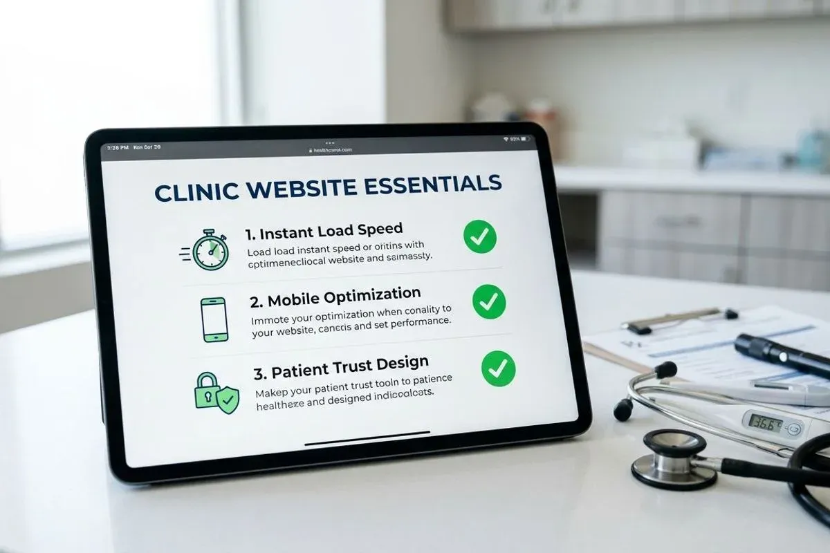
Your patients are not on your office Wi-Fi. They are on mid-range Android phones on mobile data, where a heavy website takes six seconds to appear and gets abandoned in three. Speed is a design decision, few scripts, optimized images, nothing autoplaying. We cover why this matters for search as well in website speed and patient trust.
Which features does a clinic website not need?
In our experience these add cost and nothing else: image sliders (nobody waits for slide three), background music, animated counters, chatbots that know less than the receptionist, and PDF brochures that no phone opens happily. If a feature does not answer a patient question or shorten the path to contact, it is decoration.
What is the two-minute test for your own website?
Open your website and pretend to be a patient with a specific problem, say a chipped front tooth. Count the taps until you find what the clinic would do about it and what it might cost, then count the taps to actually make contact. More than a couple of each, and the site is working against you. This test is a large part of how we structure every clinic website we build.